Auditing Overstock.com: tools, people, & patterns
A capture that I made auditing Overstock.com while working on the 2-person Design Systems team (supporting 20+ UX Designers).
The setup
There’s a lot of communication that happens around design systems, but one of the first things that needs to happen is getting an inventory of what patterns currently exist.
Working within a newly-formed Design Systems Team at Overstock.com, I was part of a duo tasked with supporting 20+ UX designers. An e-commerce site launched in 1999 — so there were many patterns.
One of my first tasks was to identify the current components, discrepancies, & mobile variation patterns across the user experience. But before touching any of that, I needed to understand the system that created them.
Observe the system first
Before making suggestions, take a few weeks (or months in larger-orgs) to really experience the communication patterns throughout the org (tools + how people operate).
- note all the tools used on the UX team
- map out workflows
(Note: if you need to knock out auditing design patterns right away, Brad Frost’s interface audit is a great resource if you want to jump in & start putting screenshots into Keynote.)
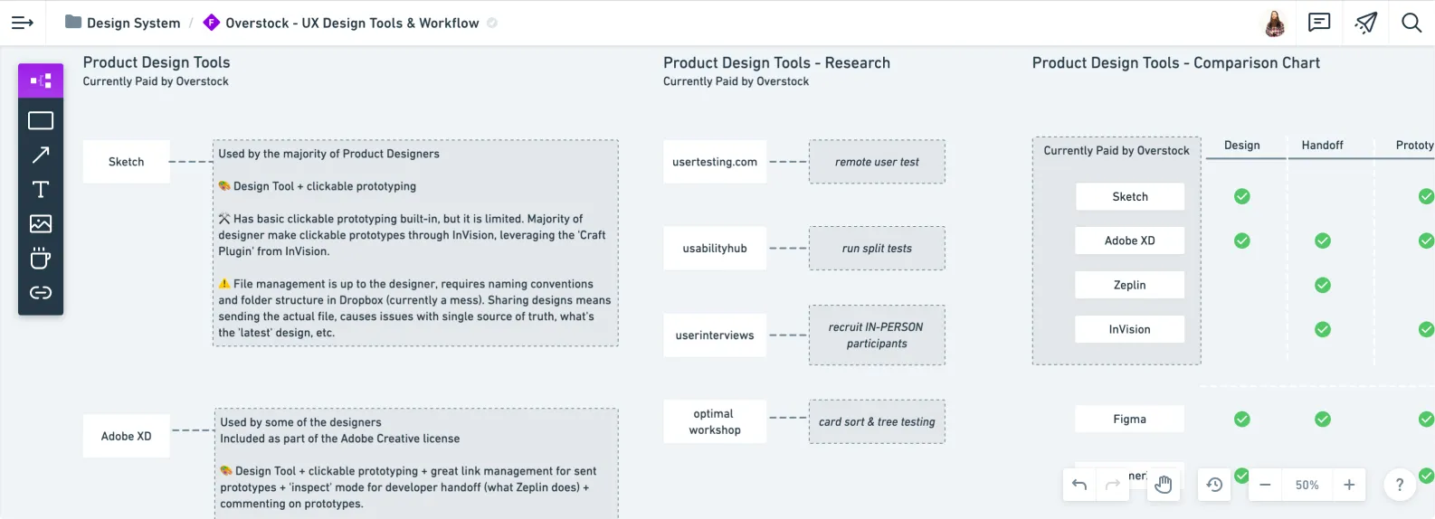
I used Whimsical to map out what the team was currently paying for & the tool’s features.
Let’s imagine you’re on a team of 15 ux designers, split across several teams along the purchase journey.
- does every team use the same tools?
- how do cross-functional teams communicate internally?
- how does the ux-team communicate internally?
- externally?
- how would you collaborate on a design?
- specifically, list the step-by-step-process
- how do people find out about design updates?
- is there a visible, centralized tool for ux-stuff?
- if a request is outside of that centralized tool, how are the comms managed around that request?
- how is research done?
- how are findings shared?
- how is prototyping done?
- how are prototypes shared?
- etc., etc.,
After a few weeks, you’ll get an idea of how people do things.
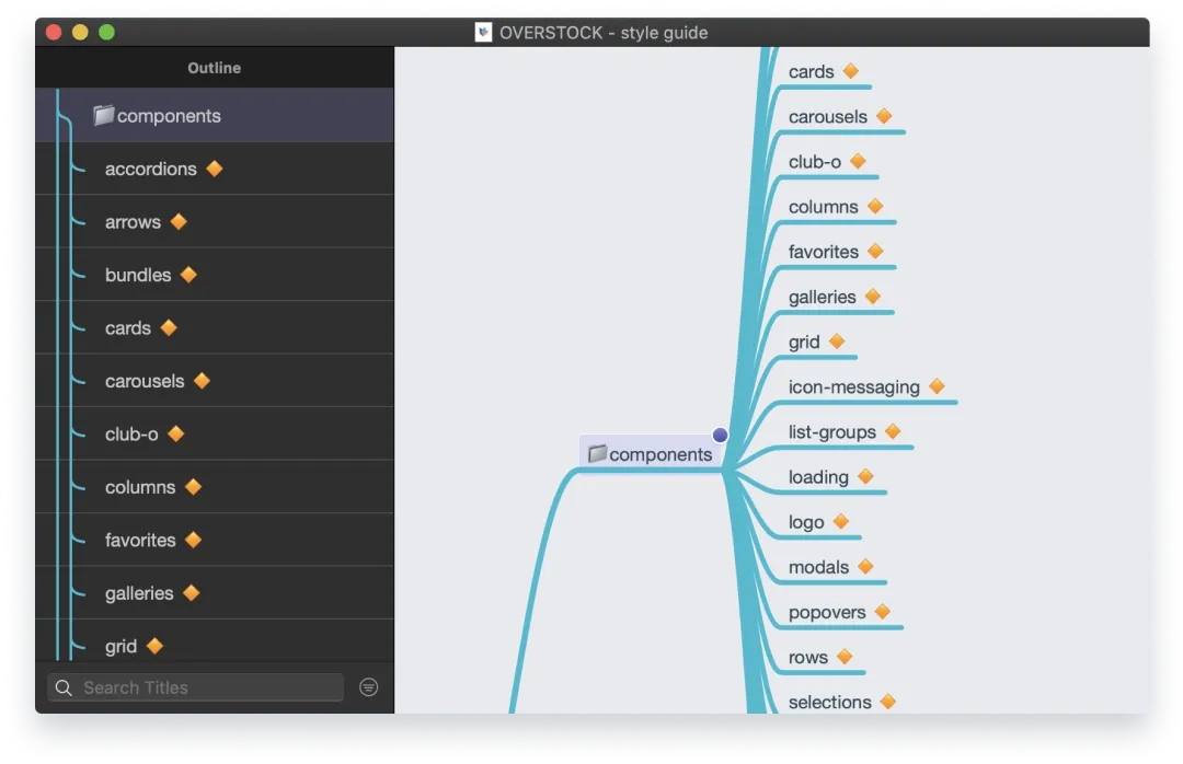
An overview of the components in the sketch library in mindnode. I like using different tools & this one is a solid native mac app for mindmapping.
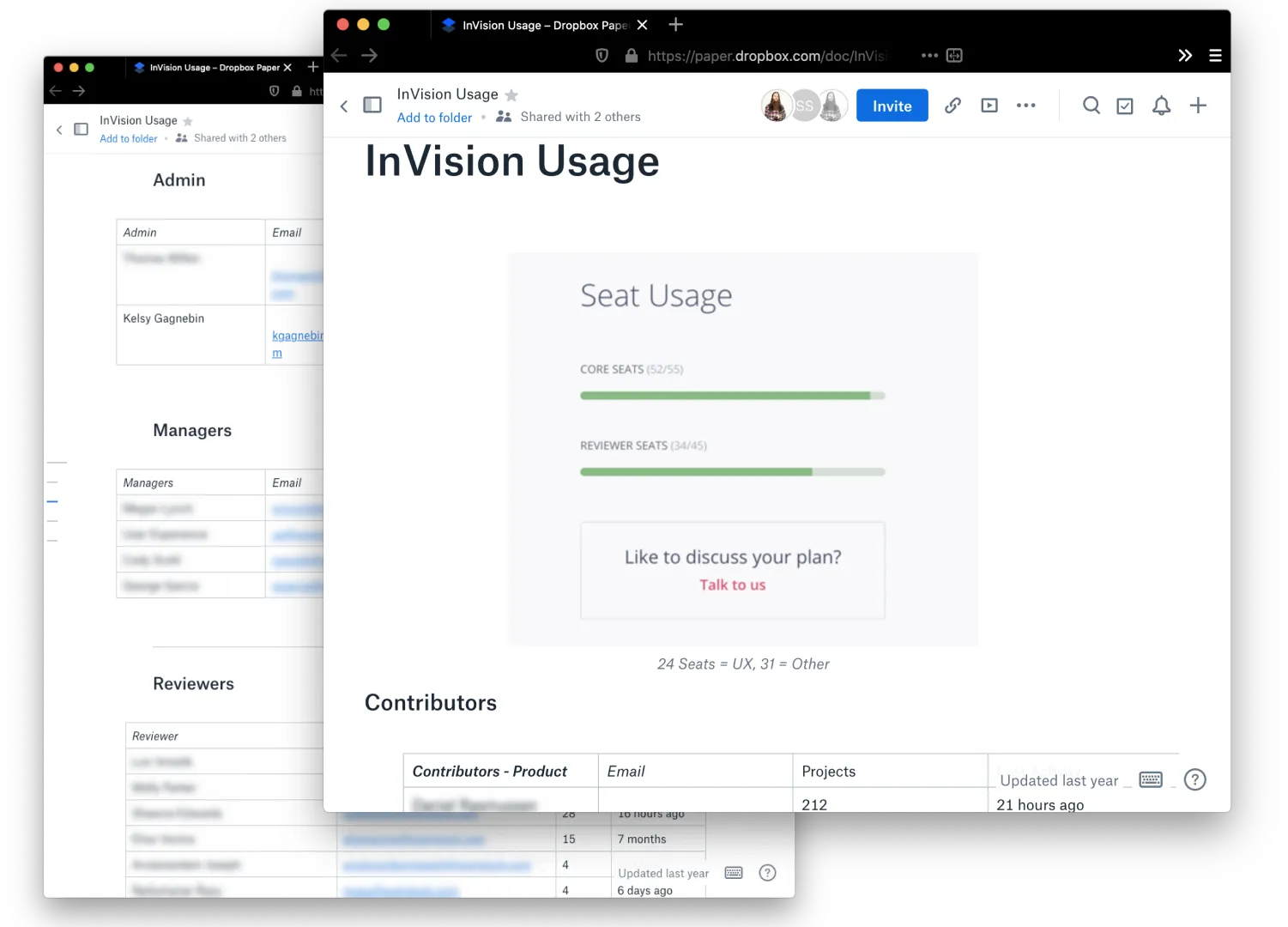
Before making too many waves, I contacted the main users of the existing tools that would be impacted by any contract changes. (note: it was only one account generating 90+% of the projects).
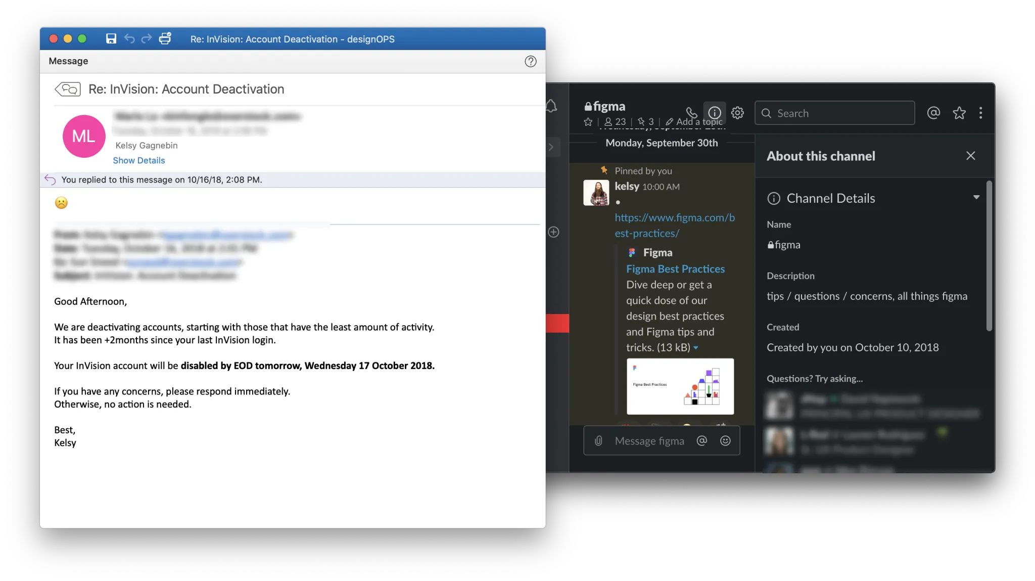
Supporting a new tool means handling the old tool comms & creating channels that support & encourage the new tool usage & adoption.
Start small, think big
I wanted to be able to show some value right away, and in the case of e-commerce, that’s going to be the PDP (Product Details Page) (what’s nice, is that in theory you’ll eventually get to everything).
Start wherever the most used part of your app/service is, which will likely contain a lot of the main components.
Design tool + browser
Using Figma and Chrome DevTools, I would start the process of interacting with the page & documenting the patterns.
After a while, you start to get into a rhythm. Having the same URL in two tabs, one in desktop view and one in mobile, then capturing component-by-component ended up being a favorite flow of mine.
It ensured that if I had to stop for something, I would have the component captured on desktop and mobile. I err on the side of desktop and mobile being ‘complete’ rather than documenting all patterns found in a certain view as complete (e.g., ‘desktop complete’). We are going component-first instead of viewport-first.

Preview of the cursors figma library that helped showing accurate cursor hover-states.
Capture everything, annotate as you go

Screenshots & annotations in Figma were pivotal in our audit. Visual documentation is invaluable — it serves as a clear reference point that transcends subjective interpretations.
Some metadata I’d include:
- date captured
- full url
- if it’s complete or not (i.e., are you halfway down the page, if so, make it clear on the design file where you left off)
What I found (& why it matters)
Zoomed in around the menu hover interactions. Even though they were a few pixels away on the nav, they were miles apart when it came to styling patterns.
It’s possible to quantify aspects of a ‘poor experience’, as defined in one part as having inconsistencies in the experience. It might be interesting to get the number of buttons that have a unique shade of blue, but what’s more interesting is understanding why those inconsistencies happened in the first place.
- Assuming there are a bunch of different buttons, how large of a technical issue is this?
- Are there multiple dev teams that would have to align on process in order to fix this?
- Does this issue impact an initiative that’s already going over not-so-well with a part of the team?
There’s an infinite amount of possible scenarios that might cause a bunch of unique buttons to show up on a product. The chances of guessing the right cause is slim, so it’s best to involve people that have insights into areas you don’t.
Alignment instead of blame
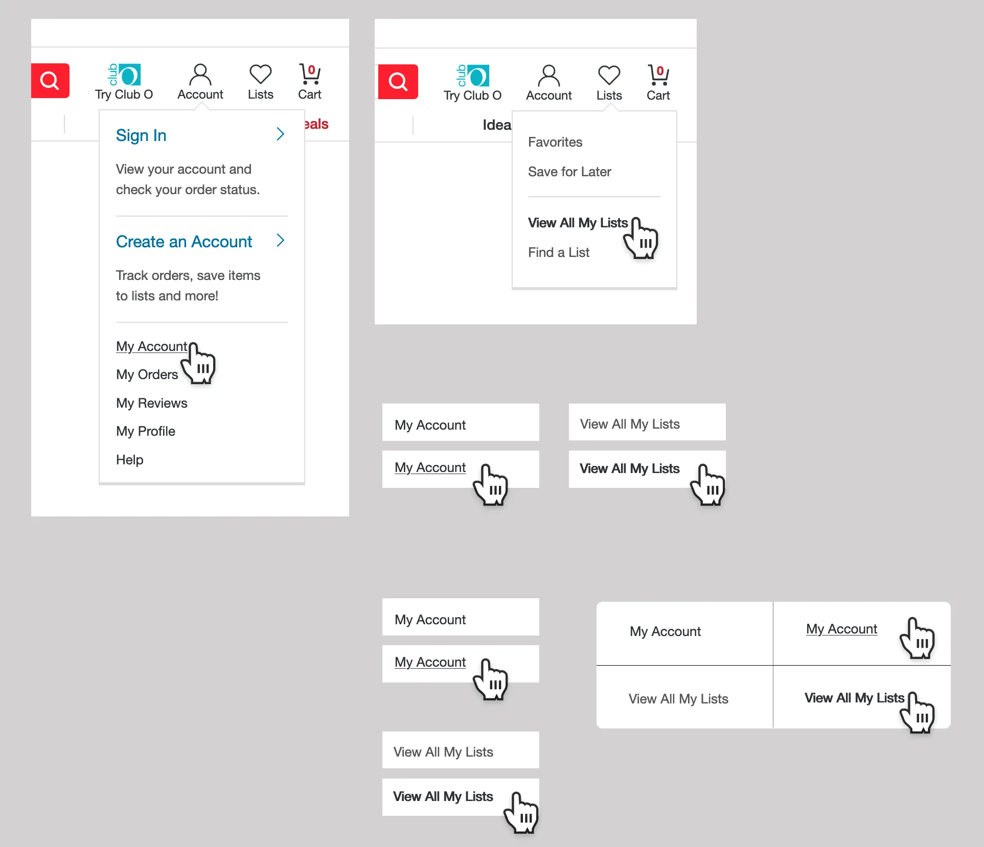
The Overstock design system page & the Paper doc I had with notes around the team’s values.
Capturing the product experience in a visual way can help build alignment & allow for discussions around patterns & current implementation. Remember to include some helpful metadata that lets you get to whatever you were testing quickly (e.g., full url, date-test, environment, etc.).
A peek at the sketch library & the library file preview, scroll* down memory lane with this howto article (external link)
When it comes to ‘issues’ or inconsistencies in the experience, it’s usually a manifestation of a human relation dysfunction somewhere along the creation line. Being mindful that there’s a human relations factor underneath the ui conversations can help bring a gentler tone.
Conversations can get muddy because people start getting design components vs. code components vs. words-only components blurred, which can create miscommunication. Stepping back & making sure everyone is aligned on what type* of component we are talking about can save some confusion.
Just remember — design components are an abstraction. It’s what’s live on production that matters.
What this led to
The audit work fed directly into a few things: consolidating the team’s design tools from 3 down to 1, building out an MVP design system in about 6 months (with limited dev resources), & creating reusable component guidelines that the 20+ designer team could actually use day-to-day.
But maybe more importantly, the process of going through the product built a shared understanding across the team about where patterns diverged & why. That made the conversations about fixing things a lot less contentious.
A dirty job (& why it can’t be automated)
There seems to be a desire to automate things, especially if it’s a process that naturally takes time to complete. For example, clicking through a site/app.
It takes time for a human to click through & experience whatever is being presented on their screen. I’m not sure of a better way to design for an experience than to go through it yourself.
Even if there are tools that can automate audits & capture components to document, there’s still the human experience of interacting with the product.
There’s a difference between reading about a 900ms blocking transition that’s happening on a key component versus having to sit through the experience.
When you go through the product & start capturing patterns, you begin to develop a broader ‘sense’ of the system. Hearing about changes, you might be able to predict how the system might respond & ask questions accordingly.
It’s tedious, time consuming, & 100% worth it.