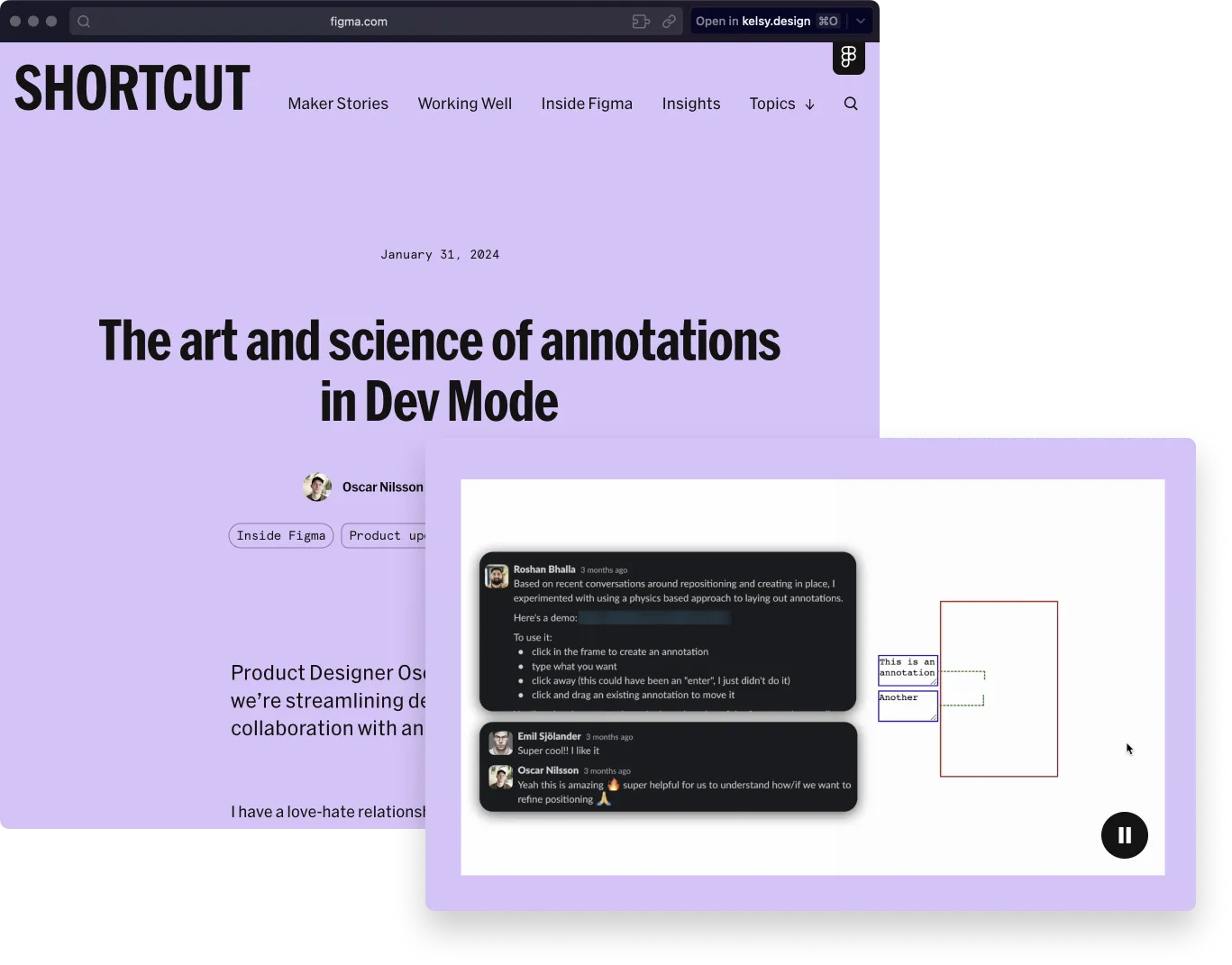
video pattern from figma blog + a lil freak
tags: 👨💻-dev, 📑-patterns, 🌱-early,
today’s source: annotations in dev mode - Figma blog
pattern for showing demo video + conversation context.
what stood out was the videos showed the demo + the message screenshots for additional context.
it’s a subtle touch, but a really liked it & will remember to throw in some message-context in the future.
it also felt familiar, but more useful that what i was starting to remember.
this little freak
then i remembered trying to show a gnarly gif + a screenshot of the app settings in procreate.
i like the pattern of still + moving in the same artifact, because it gives more chance to provide additional information.
my screenshot showed the technical underpinnings of my gif-output, but the messages included in the figma blog felt impactful for the story.
it’s hitting an intimate + useful-context spot for me, and i’ll remember this particular pattern of team message + early demos.